|
|
|
|
|
|
|
|
|
 Posted: Mon Aug 02, 2004 12:21 pm Posted: Mon Aug 02, 2004 12:21 pm
 Despite the fact that Gaia has forums meant for critiquing art, I thought this guild could use a thread for that exact purpose. As art shop owners, we need a place to ask for advice where our customers may not stumble upon it and see the art before it is meant to be seen. There are other reasons, too, but my mind is meandering away from me. sweatdrop Example:Artist  This is for a customer in my art shop. I'm not sure about her right arm (our left), though. Any comments would be really appreciated. ^_^ Bad Critique your art sucks. you ahave no talent. stop posting here stressed Not helpful and just plain abusive. Don't do this. I'll personally set you on fire. Bad Critique 2 omg! I love your art! It's so awesome! Don't change anything! It's just perfect!!! Again, not helpful at all. Nice and fangirly, but not helpful. How to CritiqueGood Critique - I see what you mean about her right arm. I think the problem is the fact that she has no muscle tone in her upper arm and it looks like her shoulder is really drooping. Maybe rounding out the shoulder a bit would help. - Her right hand seems to disappear under the gun, but you should be able to see the tips of the fingers on the near side. - The fingers on her left hand appear to have no bones. o.O - Overall, I really like the style. The choice of medium goes well with the mood. 3nodding Hope that helped! See the difference? Point out the things that need attention but also point out things that were done right. Basic Pointers on the Critique System
Post art that is no wider than 600 pixels and no bigger than 150kb. If you want to show something with a lot of detail, post the link instead.
Don't post unless you want to be critiqued. This is not a place for empty compliments. That's what the Art Arena is for.
Critique as you would like to be critiqued. Try to be helpful. Being polite doesn't hurt, either.
Don't JUST post. Critique others' works, too.
Remember that this is all for your benefit. Keep it all in good humor. I've seen critique battles start when people post art and only expect praise. Smile and nod, but take the critique for what it is. Don't consider it a failure on your part. Don't accuse the critiquing person of being incompetent, either. We're all friends here.
How this will work:Post a piece and list some general concerns if you have them. All pieces posted in this thread will be addressed, hopefully. Once you don't want any more critiques, edit your original post and replace the url with the message that you're done. Simple. 3nodding
|
 |
|
|
|
|
|
|
|
|
|
|
|
|
|
Posted: Tue Aug 03, 2004 2:10 pm
Hooray for art critique! AD, this is indeed a helpful, well-structured sticky. I have one piece I am dealing with.. I really want to correct it, there's something that has been bothering me about this picture. I wanted to make a new version, but I don't really know where I should begin, and here is it:  Points that concern me: *Eyes of the girl in the left. How can I correct them? *Legs of the girl on the left. Her bone seems chunky, but also natural.. *Chest of the girl on the middle. She looks flat! gonk *Hands of the girl on the right. They look unnatural. Too fat, maybe? I am not very good at drawing groups pf people, so this is also another point. All critiques are welcome. ^^ Thanks for the help in advance!
|
|
|
|
|
|
|
|
|
|
|
|
|
|
|
|
|
|
Posted: Wed Aug 04, 2004 9:09 am
Bloody hell. Gaia's such a pain. *kicks Gaia*  - The face of the girl on the left is lopsided, which makes the fact that her eyes are uneven even worse. I drew a few guidelines to show that her eyes aren't level and one side of her jaw is lower than the other. -I think the reason that her legs look "chunky" is because the calf muscle is wider than the thigh. I made a couple lines of where I think the lines should go. Also, the folds in her pants make the leg look like it's shaped a bit strangely. -The middle girl's ears are a bit low; ears span the distance between eyebrows and the bottom of your nose. -She looks flat because of the style of the shirt combined with the fact that you didn't add any folds to it. There should be folds at the top from gravity pulling down from the shoulders as well as folds where there's tension at the bottom. -The girl on the right seems to be looking up because her mouth is positioned so high. Is she supposed to be? -I think her hand might look "fat" to you because you see too much of it. Viewed from that angle, you shouldn't be able to see all of her fingers. If you could, they'd be curled in a lot more. *blink* I just confused myself.  Aw, you caught me in my pajamas. xd You can only see three fingers (excluding the thumb) from this angle. 3nodding -I really like the folds on the middle girl's skirt. You're really good with folds and shadows. And I want a pair of gloves like the girl on the left has. *jealous* Hope that helped. sweatdrop
|
|
|
|
|
|
|
|
|
|
|
|
|
|
|
Posted: Sun Aug 08, 2004 11:15 am
Hi! At first I must say what a great idea! And then warn you all, not just about my lack of talent when it comes to art...but about my grammar and spelling. English is not my native thounge, I'm from Sweden.Wow! Abandoned Dreams, you know what you're talking about. 3nodding I think you covered it all up there, I'm speachless. xd I'm so excited so I'll post 3 pictures I've been having problems with. Note: I use vector graphics. I don't work in layers or anything like that so I don't know if I actually can change all the mistakes. But I would love to try. ^_^#1 Couple  Okay this is not suppost to have correct propotions. I was looking for a cartoonish style. But I the girl o the right, her upperbody looks so wide but it's just the angle of her left arm, how should I correct that? Her right arm is too long I thing but I guess it's to late to change that now. Her eyes is strange aswell. #2 Kill bill  This is a quicker one. I obviously can't draw hands... sweatdrop It's very tiny I know, but how do you hold a sword? I've been avoiding to draw swords, thou I love them. >.< #3 Pimp This was the first version:  But I realized that the arm is awful and the lines where messy, so:  I simply took a shortcut and hidden the arm... Still the center of the body is somehow moved by the skirt? And some people in the art arena told me that her boobs where to far away from eachother. Wich I don't think, I mean she's not wearing a push-up bra, my own boobs look like this. wink Thank you so much anyone that could help me. heart
|
|
|
|
|
|
|
|
|
|
|
|
|
|
|
|
|
|
Posted: Sun Aug 08, 2004 5:58 pm
First of all, Chemie, I have to say that you're awesome for using vectors. whee I'm trying to get the hang of them, and they're pretty difficult. First picture - I know you said that you weren't intending the proportions to be very correct on this picture, but I think the girl on the right would benefit a lot from thicker legs and larger feet. Compare the feet of the two girls, and you'll see a major size discrepancy that can't really be reasoned away by the fact that they're wearing different kinds of shoes. I've had a lot of trouble with that certain pose too, so yay you for actually being brave enough to draw it. I tend to avoid stuff like that which is why I progress so slowly in art. sweatdrop Second picture - Overall, good job! The only thing that really doesn't sit well with me is the hand. 3nodding It looks like it needs be larger. I don't know if this is how anyone else is shaped, but when I put my hand on face, my hand is long enough for the tip of my middle finger to touch my hairline while the very bottom of my palm touches my chin, so that's the guideline I use for hand size. ^^; The knuckles are about halfway in between, so if her hand is balled up in a fist around her sword, it'd be about as big as the distance between the tip of her chin and the bridge of her glasses. Third picture -  - You were right about the boobs not being too far apart, in my opinion. It's just that in anime there tend to be a lot of females with big squishy cleavage, and I guess it made people think that they were too far apart. To fix that, you might want to accentuate the curve of them more with some extra shading. 3nodding - Another thing that lends itself to the boobs appearing too far apart is that her right (our left) shoulder seems a little too wide. Cutting that down and then altering the armpit line makes it look a little better too. - Collarbones connect to the shoulder, somewhat. If you're disgustingly skinny like me ( sweatdrop ), you can feel where the bone ends/connects to the shoulder above your armpit. Her right collarbone seems to be angled a little funny to end at her shoulder, but you did an awesome job with her left one. biggrin Hope this helps a little bit. ^^;
|
|
|
|
|
|
|
|
|
|
|
|
|
|
|
Posted: Mon Aug 09, 2004 8:53 am
Thank you so much Iyou! heart
I've only tried vector actually... xd Will try other programs when I don't have to use my mouse when I draw.
The help with the third picture was a major favor. I did'nt see that at all but you're right. 3nodding Now it looks much better all of a sudden. biggrin
About the second picture, I know I know. sweatdrop I gave up the hand thing, then I realized it was a baby hand. I did'nt know how to get the grip right so I just pretended I did'nt see it. xp
About the first picture, Yeah I know but it did'nt look good with huge feet, tried that at first. I love huge shoes thou. ^_^ It's an odd picture, gomene.
|
|
|
|
|
|
|
|
|
|
|
|
|
|
|
|
|
|
Posted: Mon Aug 09, 2004 11:48 am
First of all, I would like to thank AD for the valuable help, I relly needed some advice and not empty flattering.... Now I think I can begin with the new version of this picture, and will post the progress here... as soon as I get a scanner, that is.
^^ heart
And, Chemie... It has been a long time since I saw YOU! I love your vector drawings! (And I remember you were interested in a sawp.. PM me, huh? ) wink
I think it would also help to add a bit of "a**" (enlarge the hip bone just a bit) to the pimp girl you had, Chemie, so that she looks more balanced and feminine... whee
|
|
|
|
|
|
|
|
|
|
|
|
|
|
|
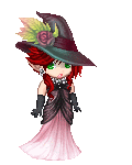
Posted: Mon Aug 09, 2004 3:23 pm
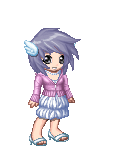
^_^;; Nyome wants to give this a try~~ good artists have to be able to take critiques, and I haven't gotten one in quite some time. @_@ I'll post two pictures I did before, and see if I can improve on them any ^^  I overuse that picture quite a lot, and it's one of my only pictures of my own avvy sweatdrop Um.. I think the only problem I have is my sketchyness, but I've long accepted that it's just part of how I draw, and no matter how i try, it's just always there. The nose gives me some problems,and I think some shading might just bring it out more, but I don't like to overemphasize noses x_x. the wings are too low, but that's cuz I wanted a smaller banner, and I wanted it to look at least kind of level. it was later made into this which looks a bit more complete to me, without the empty BG. ~ the second picture was a commission, and it took me forever on the lineart. x_x ignore the cheap BG, I was really tired.  I thought it was decent afterwards, but I know there's something wrong with the faces. I bled through some color onto her hair, so I had to smudge the hell out of it >_< and it doesn't look quite like it should~ -- thank you for anything you can point out to me, it'd be greatly appreciated. heart
|
|
|
|
|
|
|
|
|
|
|
|
|
|
|
|
|
|
Posted: Mon Aug 09, 2004 8:58 pm
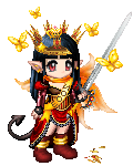
This is more to settle an argument than anything else, but I just drew a sketch for a fellow Gaian artist/schoolmate and we're having a few disagreements about the picture. (Not too bad though. sweatdrop ) The sketch is here. I've linked to it because the image is a little large and I don't want to stretch the screen for anyone. ^^; This is just a sketch, and a pretty sloppy one at that since he wanted me to get it done so quickly, so keep that in mind. - He says the legs are out of proportion. I agree with him on that, but I think they're a bit too long. He thinks they're too short. A possible cause of that is that I made the crotch of the guy's pants a little low since they were so baggy, but other than looking a tad bit lengthy, his legs seem fine to me. - He says the way that the guy is holding the sword looks painful. He knows a heck of a lot more about holding swords than I do, but what's so painful about it? sweatdrop The only thing I can think of is that his hand is too close to the guard. - He says the back is too arched. I don't know what he means by that, it looks fine to me. o_o; I guess mainly what I'm looking for is critiques on the proportion. My friend didn't mention the guy's head, but I think it looks a little small for his body too. Any comments would be appreciated. 3nodding
|
|
|
|
|
|
|
|
|
|
|
|
|
|
|
Posted: Tue Aug 10, 2004 9:29 am
Hey guys! I just finished a commission for someone!  Is there any critique you guys could give me on it? I really love it, but there's something funny about it, I think her breasts are too low or something. And do the wrinkles and folds look alright? I actually used my sister as a model for them! I'm not too good at folds. sweatdrop Anything else you could point out would be great, but for now, I can't stop looking at this! It makes me happy for some reason! =D
|
|
|
|
|
|
|
|
|
|
|
|
|
|
|
|
|
|
Posted: Tue Aug 10, 2004 9:53 am
Iyou!!! I'm going to work on a critique picture for you. ^^ I'll be right back or so. ^^; One thing about the head that I can't show you on it though, it is too thin in width, it should almost be as wide as the waist. EDIT: It's done! ^^  Okay, the thing about his face is that the chin was out of alignment. Try mapping out faces with lines next time or something like that. I really loved his face though, you did a great job on his expression, and the length of the face really adds to the manliness. It's just awesome! =D His legs are the proper length, but if you want to give him longer legs, that's fine too. wink And make sure to show that crease in the elbow on his left arm. His left. ^^ And make sure the neck is thinner and that muscle shown is higher. His neck attached to his head oddly, but it's not that bad. =) And I don't think you should define the wrists like that, it's too announced and looks like that hands are attached to the arms in an odd way. What I really liked, is his chest! It looks very good, broad and manly. ^^ Very powerful stuff. 3nodding And the hair you make looks very good too. It flows very nicely and isn't stiff at all! And you draw good folds and wrinkles. ^^ I like how you did his crotch too, but I'm not perverted! It just looks nice! ;o; Your sense of anatomy is good too, like how you drew the muscles in the arms, though I think the arms may be a tad long. I just noticed that, so it's not drawn in, I think it just may be the fact that his hands are too big or something, but that's okay. ^^ I think that's what making his legs look short, so try making the hands smaller and shortening the arms, it should fix your problem with the legs, because they weren't about his legs! ^^; All of what I think you need to fix, I've marked in red and made notes all over. I hope I didn't mangle your picture... sweatdrop I really liked it. Eep, I wrote a lot. sweatdrop I hope that helps you though.
|
|
|
|
|
|
|
|
|
|
|
|
|
|
|
Posted: Tue Aug 10, 2004 10:34 am
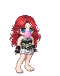
DarkishStar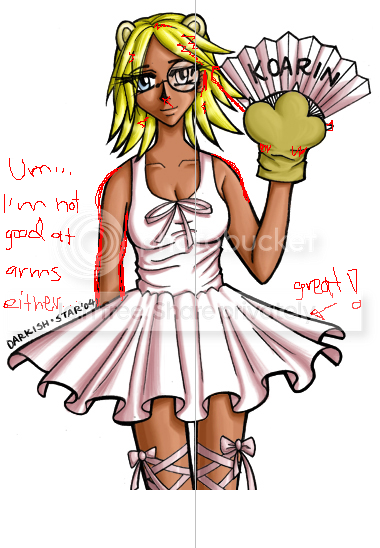 (Sorry it's ms paint xd ) (Sorry it's ms paint xd )I love your coloring,and sharp lining. I think the wrinkles and boobs are just fine. 3nodding Awesome work with the skirt. The things I see right now is that her right arm (our left) is too straight and skinnier then the other arm. Plus, shoulders sticks out a bit. (see picture) Then I don't think you should use black lines in the hair that is so yellow, just a darker shade would look better. About the cat gloves, I pint out 2 lines I did'nt like. And the " I don't know what it's called in English" should me in front of her face. (see picture) When her face is straight forward, you usually can't see all of her ear. I also drew a gray line between her legs and up to show that her upper body is leaning. There's nothing wrong with that but it can look kinda wierd when drawn. And finally, her nose looks like some sort of pyramid with that shadings, no offence. sweatdrop I feel mean by telling you all this. >.< I'm not saying I'm right, I'm not that good myself.
|
|
|
|
|
|
|
|
|
|
|
|
|
|
|
|
|
|
Posted: Tue Aug 10, 2004 10:47 am
Chemie:
Thanks so much for pointing them out! I really did draw the body leaning on purpose, yeah, it does look kind of weird now. ^^; The hair, I drew it like that in pen, so I can't fix it now, but I'll keep the tip in mind. Yeah, I thought there was something weird about that arm, but I just couldn't put my finger on what is was. Hmm, I didn't know that about the ear! when I look in the mirror to do ears, mine stick out! O_o;; Eek, my ears must be big. xD Heh, I don't know really how to do frontal noses, so I guess it does look like a pyramid. o_O;; I'll have to look more at pictures pretty soon. =D The folds in the gloves are weird, I need to study gloves more too. >.>
Oh and the fan, I put it behind her hair because I didn't want to hide her hair! Mweh, I'm so childish. xD I'll try to remember to put it in front of the face if I ever have to draw fans again. ^^;
Thanks a lot! You helped out a bunch! =D
|
|
|
|
|
|
|
|
|
|
|
|
|
|
|
Posted: Tue Aug 10, 2004 10:51 am
Nyome Jipe!
eek heart *worships her scetchy style* If you have a list for a portait and it has a slot somethine, would you let me know? rolleyes
The only thing about yor pictures that concern me is about the guy's face. I think his mouth should lean more counter-clockwise (can you even say that? excuse my English) Or his nose should'nt be that much sideways. See what I mean? I'm not even touching your pictures with ms paint... xd
Deuxia Devonair
Hi, and arigato! *sending PM* ^_^
|
|
|
|
|
|
|
|
|
|
|
|
|
|
|
|
|
|
Posted: Tue Aug 10, 2004 11:01 am
DarkishStar Chemie: Thanks so much for pointing them out! I really did draw the body leaning on purpose, yeah, it does look kind of weird now. ^^; The hair, I drew it like that in pen, so I can't fix it now, but I'll keep the tip in mind. Yeah, I thought there was something weird about that arm, but I just couldn't put my finger on what is was. Hmm, I didn't know that about the ear! when I look in the mirror to do ears, mine stick out! O_o;; Eek, my ears must be big. xD Heh, I don't know really how to do frontal noses, so I guess it does look like a pyramid. o_O;; I'll have to look more at pictures pretty soon. =D The folds in the gloves are weird, I need to study gloves more too. >.> Oh and the fan, I put it behind her hair because I didn't want to hide her hair! Mweh, I'm so childish. xD I'll try to remember to put it in front of the face if I ever have to draw fans again. ^^; Thanks a lot! You helped out a bunch! =D I'm also often end up with leaning pictures. You should keep track of that center with some sort of help lines. 3nodding (I'm too lazy thou... xd ) FAN is the word! Thanks I did'nt know that. We call them (translated) sun feathers in Swedish. Kinda cute, huh? :3 I'm sure your ears are perfectly normal! 3nodding But mine looks differnt from the side, then you can see all the funny curves that I've never even tried to draw. xp Props to you for having the currage. Keep up the good work! If you're changing your picture show the result to me, will ya? biggrin
|
|
|
|
|
|
|
|
|
|
|
|
|
|
|
|
|
|